Inspiration
For my website I was heavily inspired by the Sputnick Agency website and its cool collage aesthetic.
Sputnik Design Team Website
I also liked the look of the Youtube rewind website and how they used horizontal scroll. I thought it created
a unique user experience that we don’t see very often.
Youtube Rewind Website
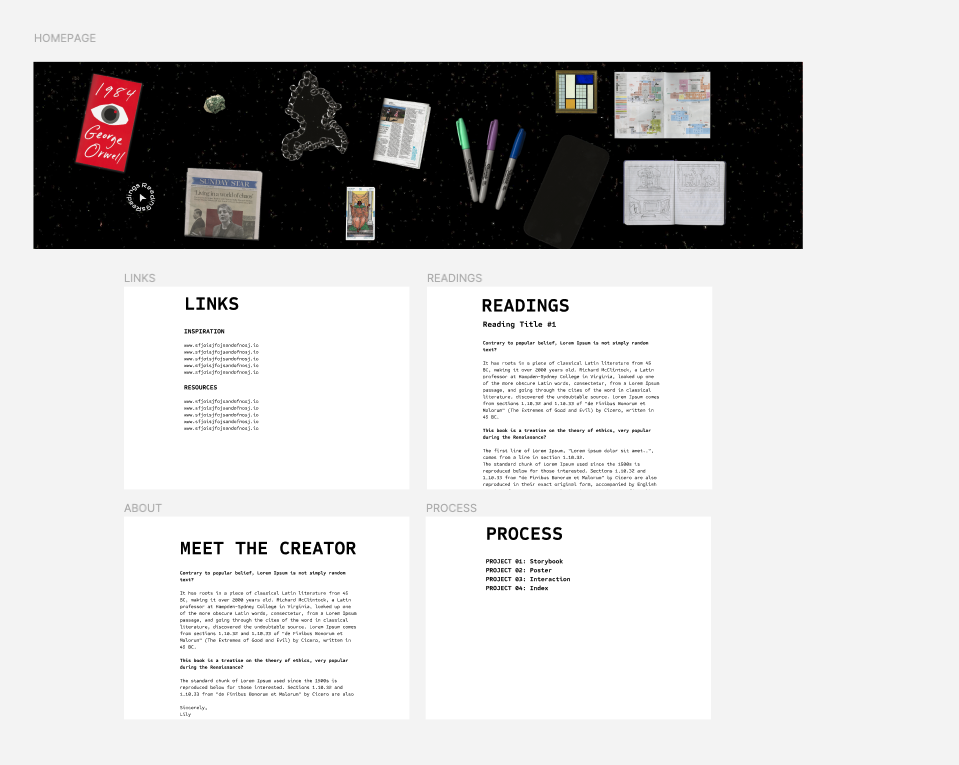
I wanted to recreate this in my own way but incorporate my love for story telling. The goal was to have my
index be an overall representation of who I am and my style. To execute this I decided to make it look like
items from my purse have spilled out. I like the idea of different items symbolizing different aspects from
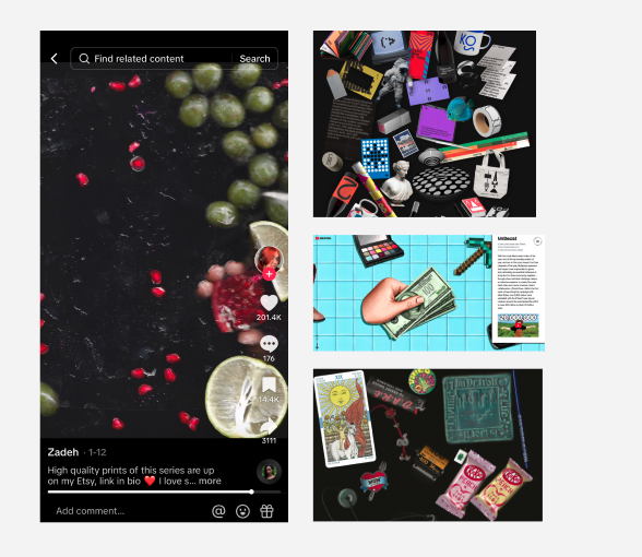
class. Plus, some items are a story in itself. I’ve also seen scanner art on social media and liked the
overall chaotic, yet intentional look. The vision for my index was to be a conglomeration of various items
around my house that would represent different projects yet encapsulate my experimentave style. The scanned
images would add a handmade aspect to the work and create a cohesive and dynamic look.
Scanner Art TikTok Inspiration
Process
Scanning
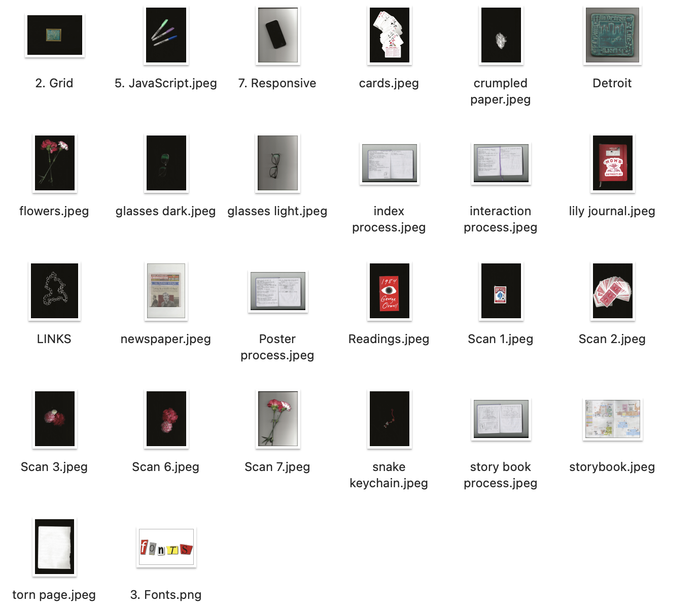
I organized a list of all the things I needed to include on my index and started collecting items around the house. At first, I scanned various items that represent just myself to get an idea of how the overall website would look. Then I scanned a bunch of them and there was a lot of trial of error with lighting and positioning until I was content.
Figma
Then I edited the images to be transparent background png files and uploaded them to Figma. I recreated the
relative sizing for the page and how I would want them to recreate a scattered look.
For page oranization, I combined my readings to make it a more seamless experience for the user. I also
decided
to include an about page so viewers can get a sense of who I am as a designer. The links page is also a basic
page with links categorized for different uses. To sort the process pages, I put the links all in one page so
the user can choose which process they want to view first. I also did this so I could represent all 4 project
process with one image. These pages all utilize the Sometype Mono Typeface because I wanted the miscellaneous
pages to have an analog design like they were written on a typewriter. I thought it would make it recognizable
that they are a grouping of other pages but also add a personal touch like a letter.
I also thought about how I wanted to incorporate animation and custom fonts. I saw one of my classmates
interaction project and really liked the custom cursor they had. I recreated it in Figma to get a visual
sense.
The typeface of the cursor is the Google’s NovaSquare font. I liked the rounded edges and angles of the sans
serif typeface that gave it a futuristic tech feel.
Code
I started by grouping all my pngs into a class so they can be together. I also gave the imgs id attributes to
make the styling more specific. In CSS, I had to give specific measurements since the original files are like
3000px. I also changed the x and y overflow so that it was just a horizontal scroll. The background image is a
scan of the scanner with nothing on it to recreate the texture. As I was placing the images, I originally
intended to have them be positioned randomly every page refresh but opted against this because I like having
the order of assignment groupings be consistent. This would make it easier for the user to navigate if they
catch on to the pattern.
For the cursor I followed a Youtube video that taught me how to animate a cursor to have spinning circular
text. To split the words into separate characters I used a splitting cdn link. To create the animation I used
a link from the GSAP animation library. I adjusted some of the script to troubleshoot and change the rate at
which it moves with the cursor.
GSAP library Link
Splitting CDN Link