Concept Ideation
Originally I had looked into parallax scrolling, and wanted to evolve my idea around storytelling. However,
when consulting with Prof. Ha I realized that my idea was too centered around the content of my website rather
than the interaction element by itself. By suggestion, I looked more into the history of scrolling, infinite
scroll, and the scroll bar. I was also inspired to use a play of the word scroll or to even take inspiration
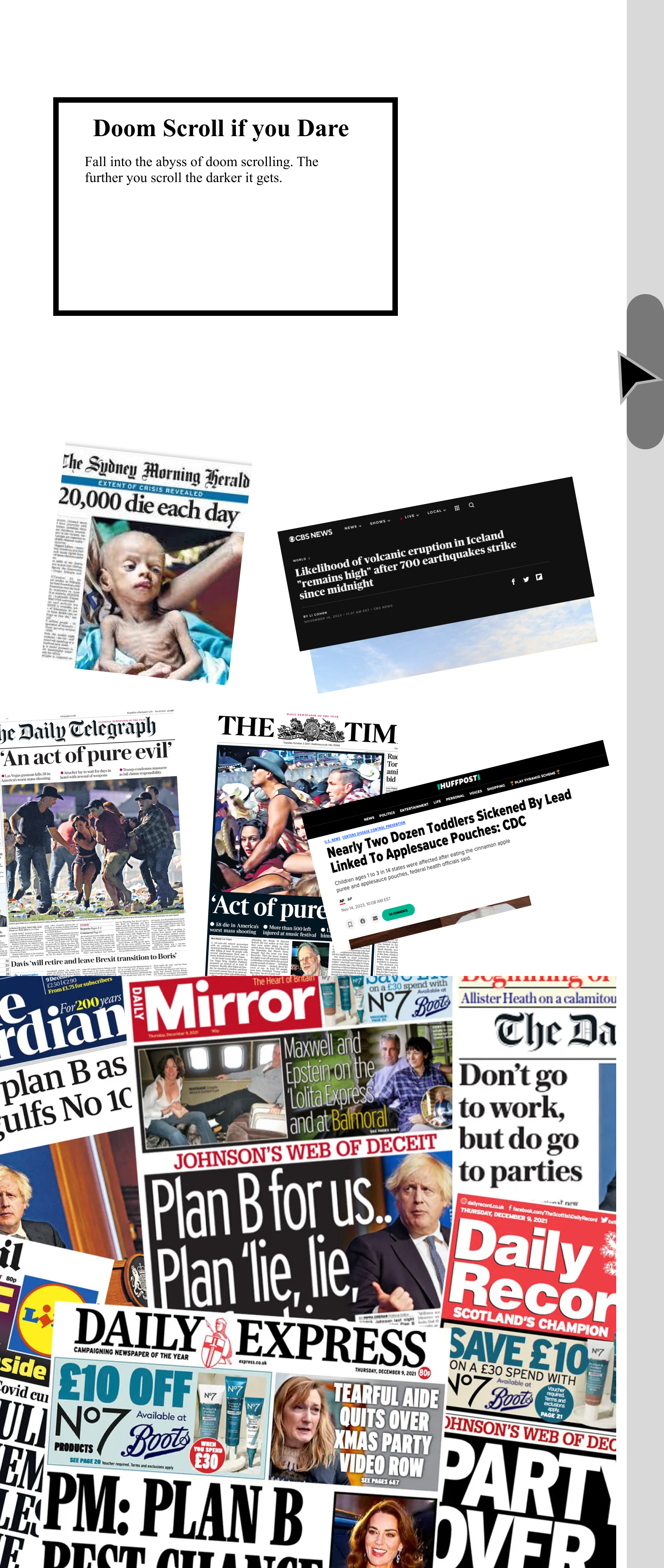
from everyday life. So I came upon the concept I have known as doom scrolling. By definition, it is the act of
consuming negative media on the internet that can have a huge impact on your mental health. Prof. Ha also
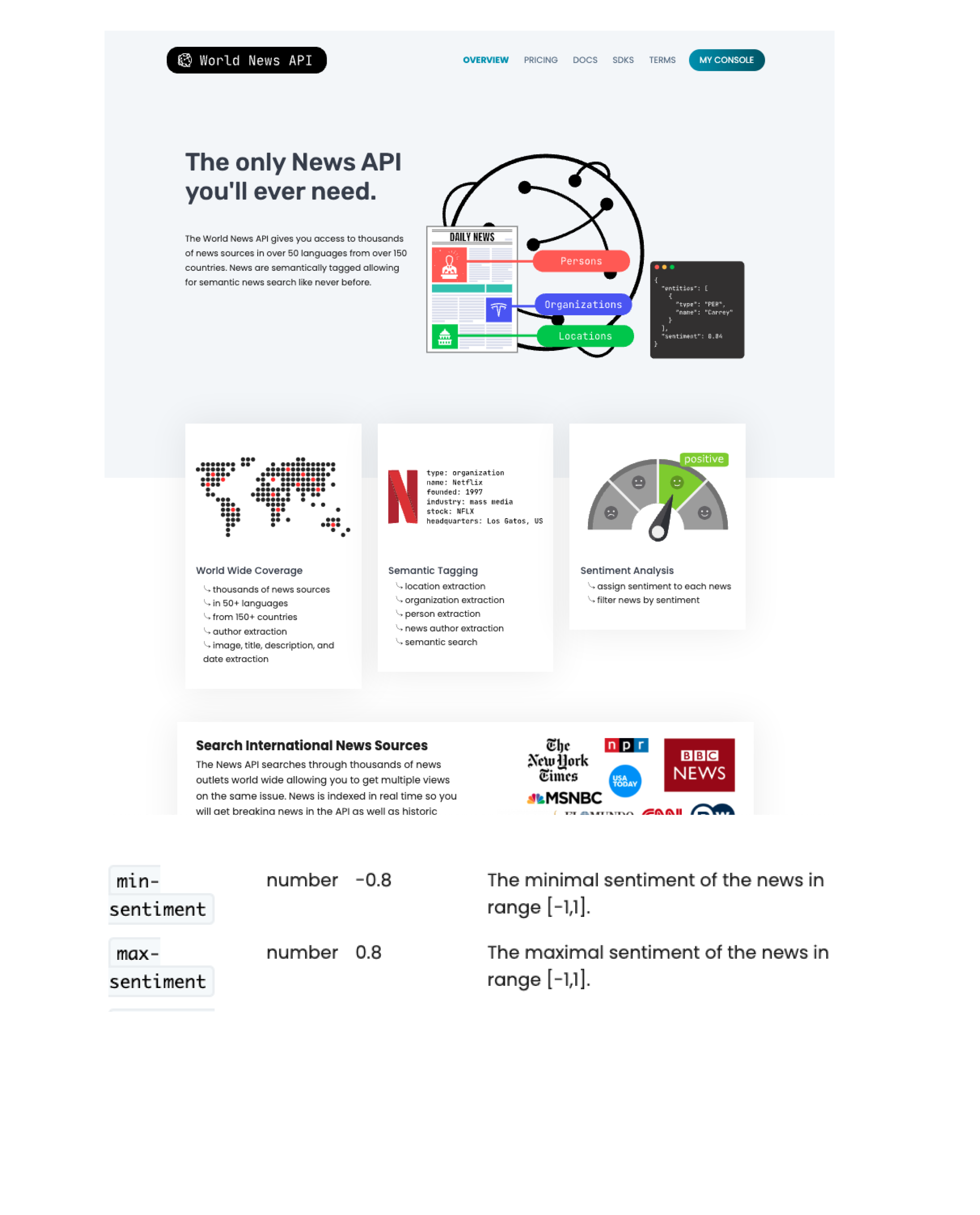
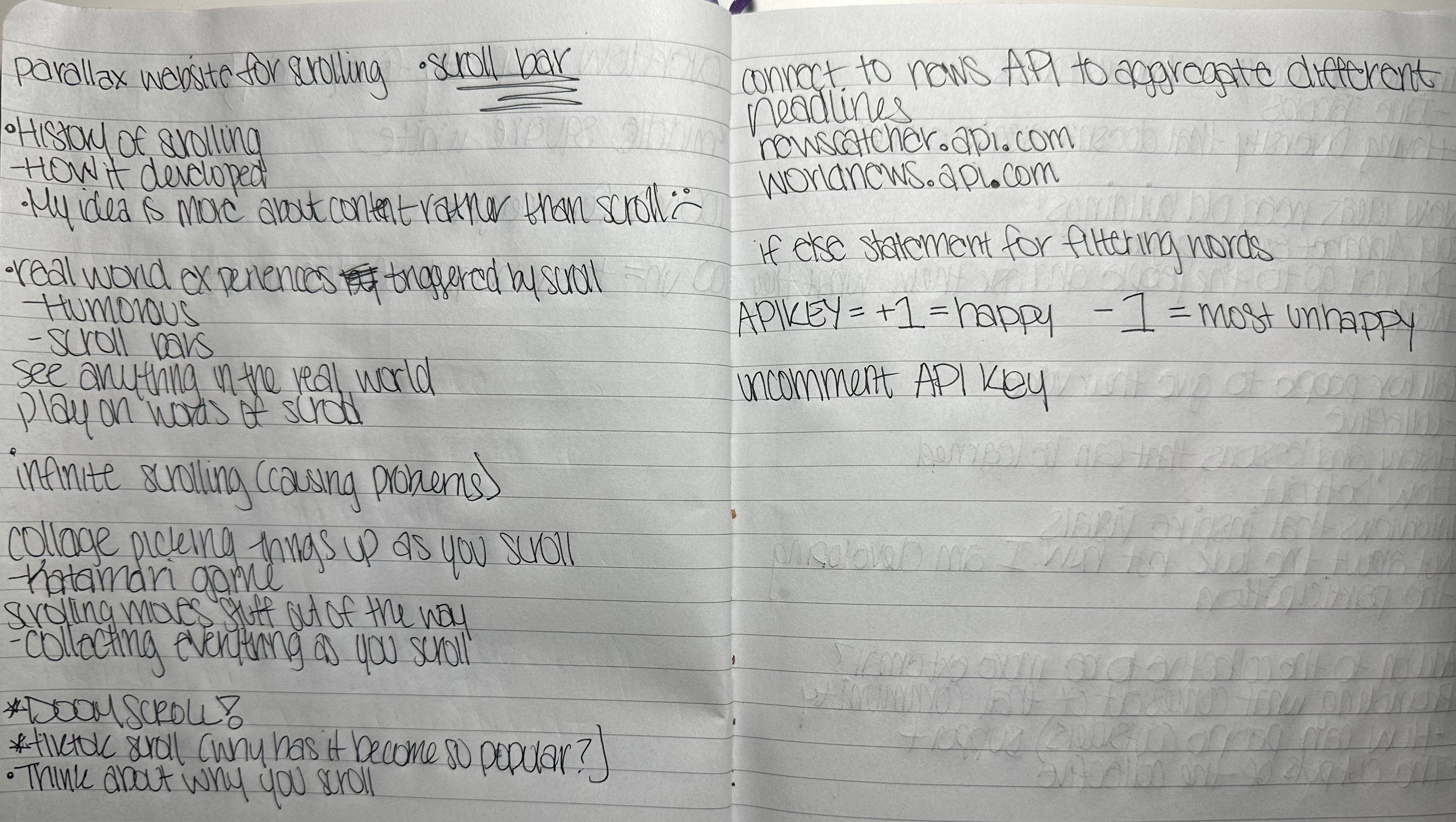
recommended that I source live news using JSON and API that we learned that day to enhance my idea even
farther.
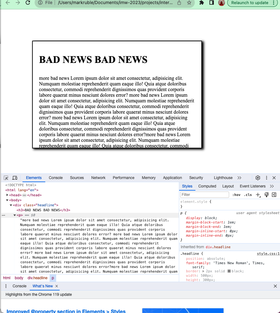
Overall, I wanted to encapsulate the idea of doom scrolling in my website by having a page that is populated
with bad news the further you scroll to embody the user experience of literally entering the void of the doom
scroll abyss.
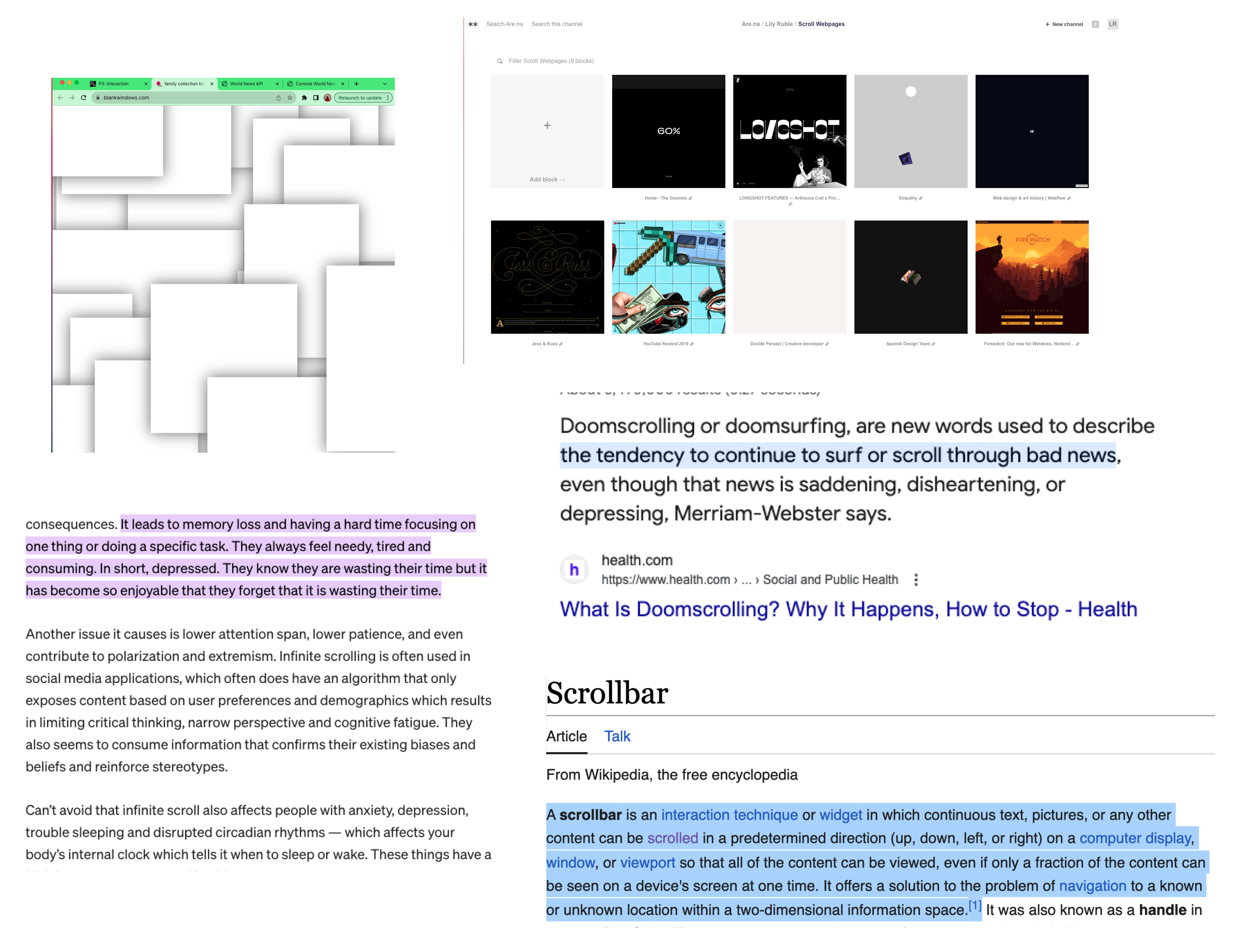
Visual Inspiration
For aesthetics I really liked the overcrowded look of the blank windows website that was recommended as a
resource for the project. I eventually used this look in my design by recreating the white boxes and a shadow
to add depth to the look.
I also created an are.na account to gain inspiration for the different ways people have utilized the scroll
bar, but deviated my idea from these websites.
I also found inspiration from the research that I did based on the impact of the infinite scroll. Infinite
scroll affects your mental health, attention span, and can even contribute to polarization and extremism. By
incorporating the infinite scroll, I wanted it to be a symbol of never ending escape from bad news once you go
down the rabbit hole. I want the user to feel overwhelmed with the nasty headlines the further they scroll. I
also wanted the news to get worse the deeper the user goes.