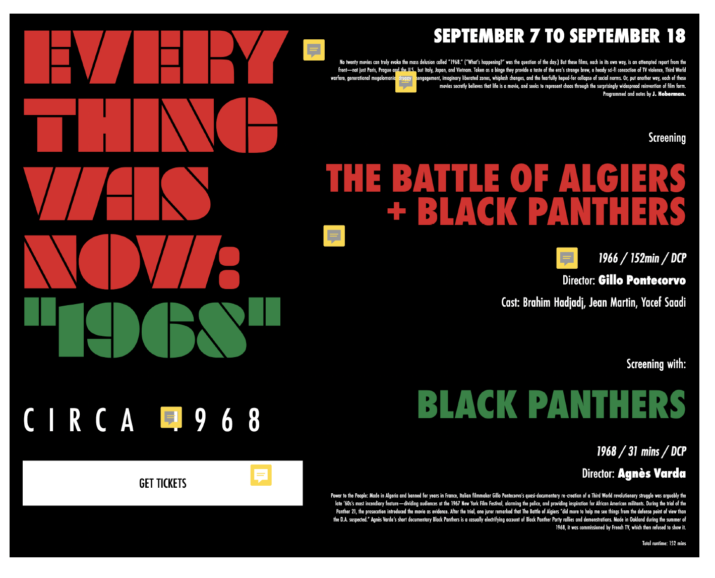
Inspiration
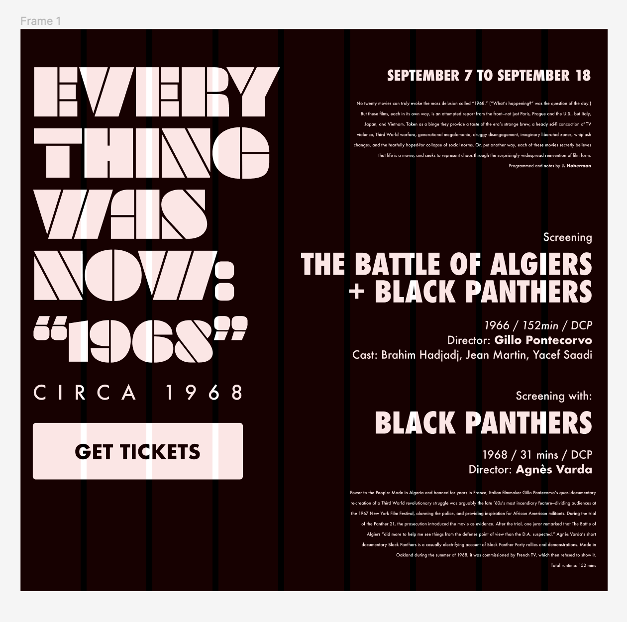
I chose the Black Panther Film Festival event because I really enjoyed the idea of creating a poster
design for a movie. I also thought I could add a lot of character based on the content.
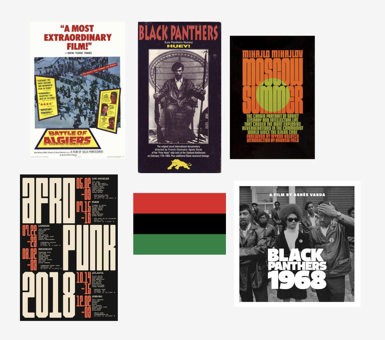
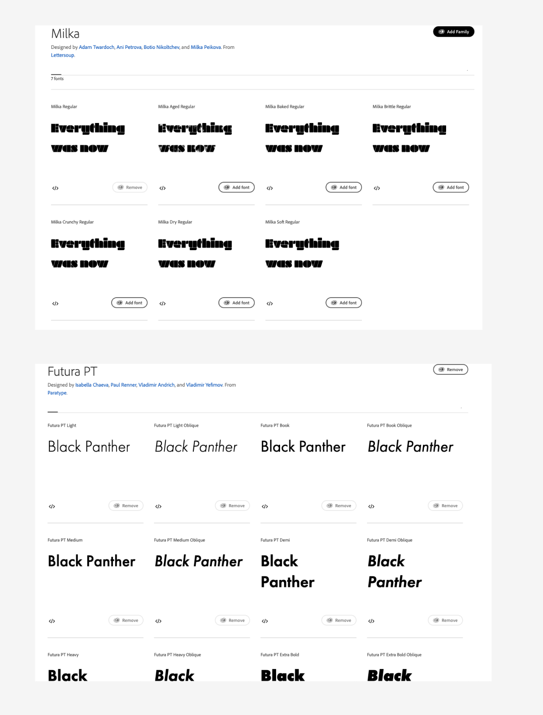
I was largely inspired by retro fonts and a militant look for typefaces. I chose the Adobe Font
Milka because it had a nice decorative and geometrical elements that created a cool font that
reminded me of the 60’s era. I went with futura bold condensed for the headers and futura bookface
for the paragraphs. I chose these san serif fonts for the subcopy because I wanted to pair the
decorative title with a simple and legible typeface that felt relevant to that time period as well.
I knew I wanted it to have stark contrast so I went with black as the background and white text to
make the copy pop. However, I knew I wanted to have color to emphasize certain content so I took
inspiration from the Black Panthers colors from the 1960s.
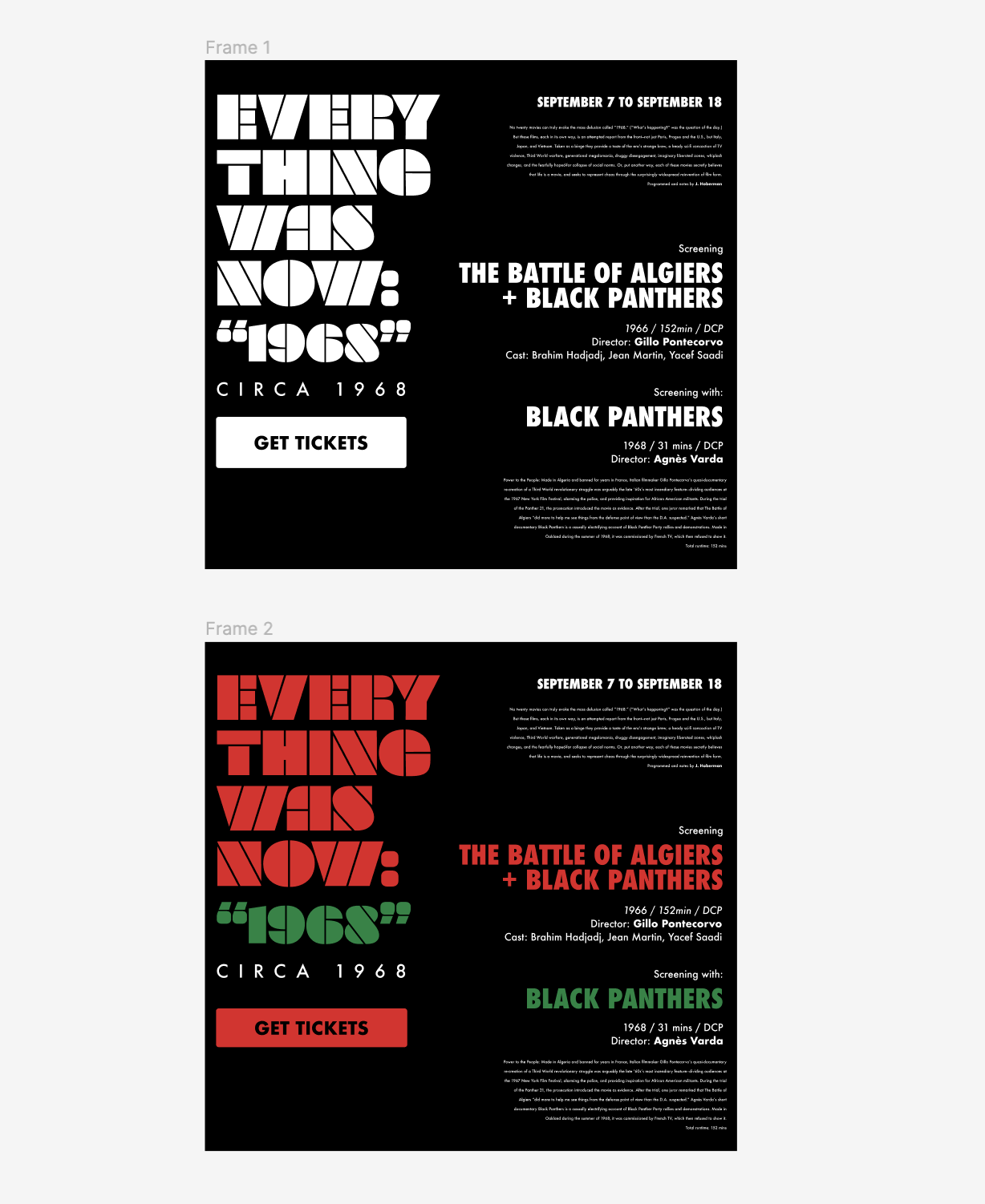
Process: Figma
In the beginning process I decided to start out with grid with only columns so I can get a better
understanding of the vertical spacing on the frame. I tried out different layouts for the title, but
ultimately aimed for a rule of thirds layout ratio. With the title being ⅓ and the subcopy taking up
the rest of the page.
Figma also allowed me to figure out consistent sizing for my headers and body copy in regard
building hierarchy. It helped me think out the line height and different weights for specific
elements.
Process: HTML and CSS
A lot of the learning process involved playing with the vh and vw feature to make it responsive with
the webpage dimensions changing if expanded. I also experimented with fixed margins so that text
would be aligned closely with the figma file. I also tested out different ratios of vh and vw to
create a consistent hiearchy.
This project also got me more comfortable using the span and break feature in html so I could
customize individual elements within the text. I also gained a better understanding of flex and grid
and used it to keep my sections accurately divided.
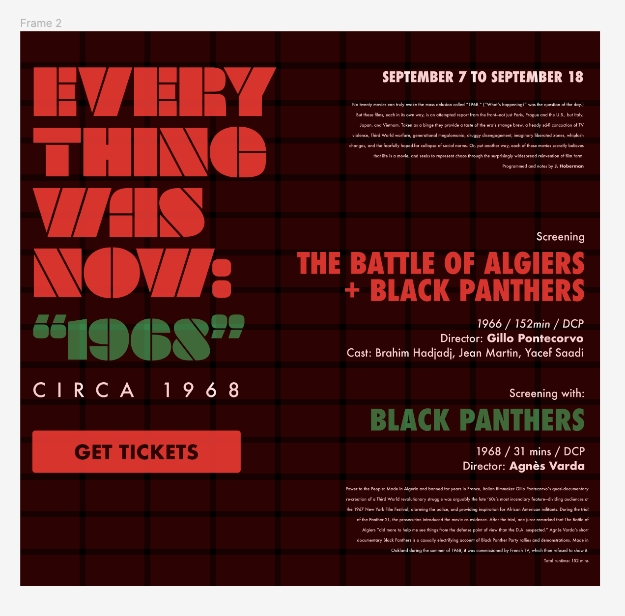
Process: Feedback
After receiving feedback I decided to utilize slight hover animations to play with the color palette
but also show intention of a clickable link. This is in comparison to having static color on the
movie titles and I think it adds more clarity that it is a link.
I also changed the CTA button text to be more cohesive with the size of the button and rearranged
the order of some of the content based on other movie posters. Prof. Ha also noted that the body
copy was too small to read. So I changed it from Futura condensed medium to a wider and thicker
version called Futura bookface. I wanted my body copy to be even more legible so I increased the
size too based on suggestion.